BlackBook Magazine
Print Redesign

Challenge
Established culture and nightlife brand BlackBook was looking to breathe new life into their print magazine by refining their aesthetic and content to drive more luxury advertising.
Strategy
The vision focused on upscaling and rejuvenating the brand look and feel while rebuilding both internal teams and the freelance pool to spotlight a higher calibre of designers, writers and photographers.
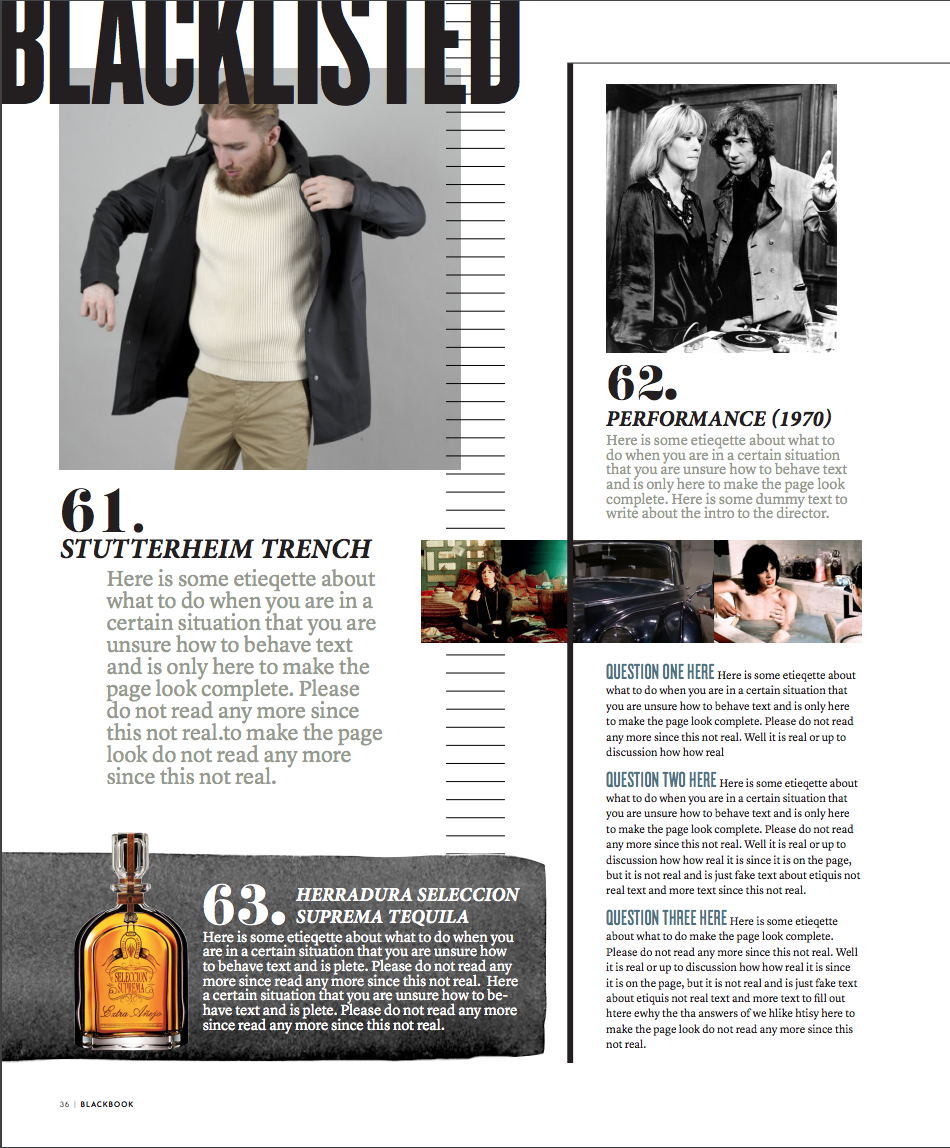
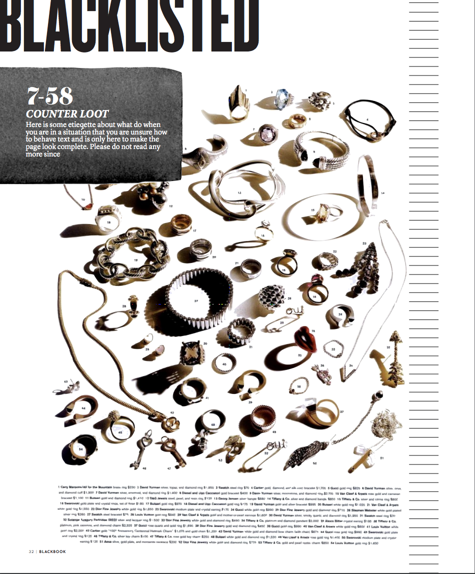
The brand design shifted away from an unfocused style guide with unrefined fonts and simplistic layouts to a tighter, more sophisticated approach.
The front of the book was completely reshaped to focus on design fundamentals, product presentation was rethought to be more visually engaging, and features used photography and text in a more inviting and intriguing way to pull readers through each story.
BEFORE…
AFTER…


Let’s work together!